ShopDreamUp AI ArtDreamUp

Deviation Actions


Description
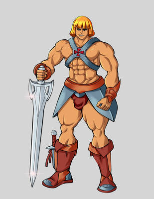
My tribute to Boris Vallejo.
I discovered oils painting in 1996 when I purchase this extraodrinary book [link]
It was more useful than any course and technical lessons I took in the past 2 decades!
Fully done in Painter 11. I put around 25 different oils glazing and digital watercolors just for the skin and spend already 30h on it (probably due to the fact that I changed my mind several times and because I did the skin with a 400x zoom : (Smile)") )
)
I discovered oils painting in 1996 when I purchase this extraodrinary book [link]
It was more useful than any course and technical lessons I took in the past 2 decades!
Fully done in Painter 11. I put around 25 different oils glazing and digital watercolors just for the skin and spend already 30h on it (probably due to the fact that I changed my mind several times and because I did the skin with a 400x zoom :
Image size
2588x3660px 5.71 MB
© 2011 - 2024 Bisanti
Comments3
Join the community to add your comment. Already a deviant? Log In
Hello! Hopefully this critique will help you out.
First of lets start with Conan himself. You have really pulled out the stops here in making him look as perfect as possible, he looks great! However, I feel you have over exaggerated his muscles making him look somewhat unnatural; especially in the leg area. Muscles are underneath the skin and not every contour shows up on top, no matter how muscletastic he may be! The only way to fix this would be to study some pictures of legs and tone down some of the muscle separation lines. All in all though, great job with his top half and your shading is very impressive.
My main issue with this piece is the background seems rushed and there is no clear light source. The shadows underneath Conan suggest the light source is to the far left, but there is no shading on the castle or ground in the distance. Due to this, the atmosphere is lacking greatly. The castle itself is well drawn, but it does not fit very well with the picture as it has a sketchy appearance with no shading.
If you want the picture to look whole and create an impressive scene your lighting and atmosphere is [b]everything.[/b] The whole right side of the castle should be darkened. The rocks need to be a stronger colour, as well as the greenery around the bottom of the rocks. I'm guessing these have been painted with lighter colours to give the illusion of distance, if so then the castle details are much to sharp. You should remember that as you move further away you lose both colour and detail but not density.
All in all you have a good composition here, good perspective and you should be proud of the outcome. Just extra time is needed to give the background some tender loving care to match it up to Conan's standards!
~Holly